Charts
Use a chart to summarize records, compare categories, show change over time, or surface one important number.
Understand a chart
A chart is another view of a dataset. It summarizes the records that match the view's filters; it doesn't create a separate copy of those records.
Every chart answers two basic questions:
- What should Bidlo measure, such as a record count, sum, or average?
- How should Bidlo divide that result, such as by status, contractor, or month?
Create a chart
Create a chart page when you want a standalone visual that teammates can open from the sidebar.
- Select
Newin the team toolbar. - Select
Chart. - On
Fill your Chart with, choose a suggested dataset, a template, or a dataset underDatasets. - Rename the page so its question is clear, such as `Projects by letting month`.
- Open the view settings to configure the chart.
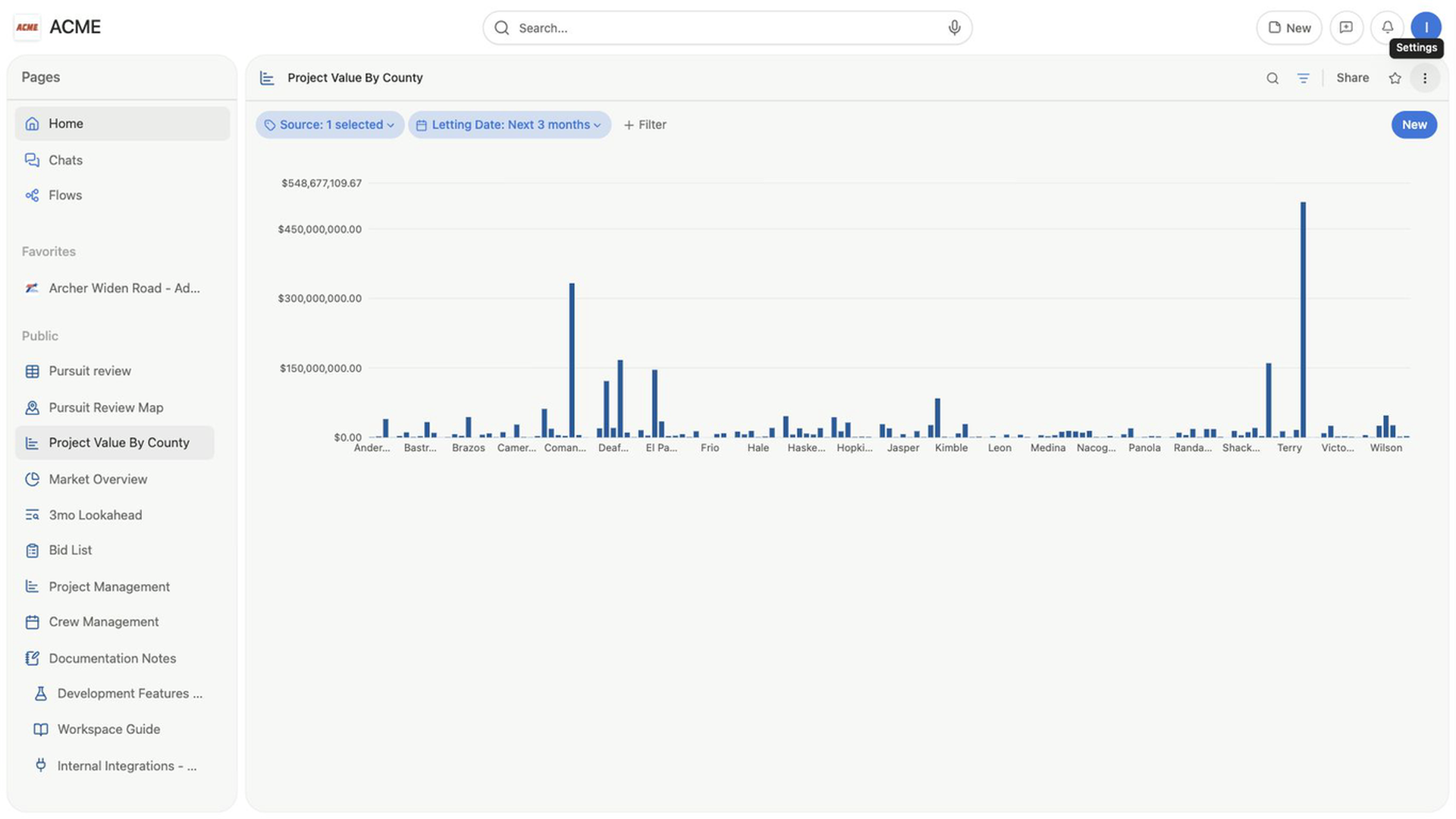
The chart opens with the selected dataset. Bidlo starts with a column chart, and the settings panel tells you when another field is needed before the chart can render.
Choose a chart type
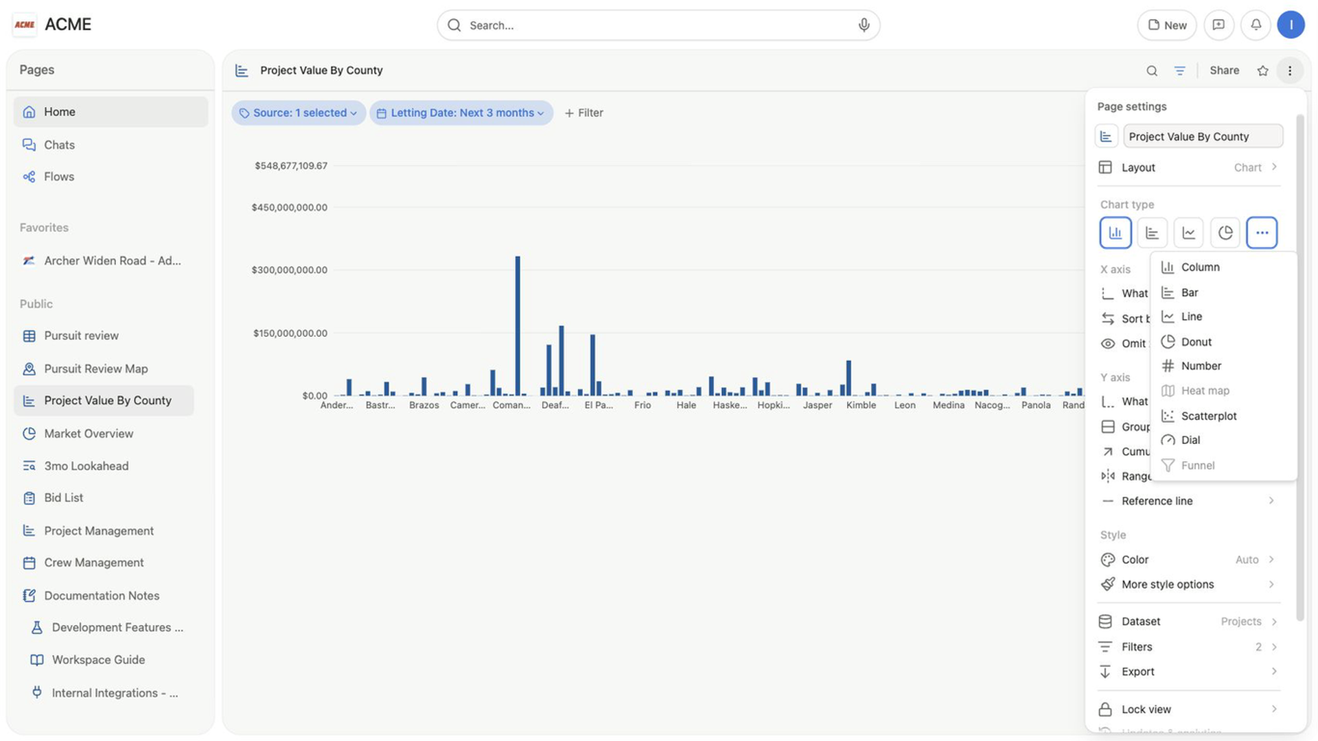
Open the view settings and use Chart type to choose a format.
| Chart type | Use it to |
|---|---|
Column | Compare values across categories with vertical columns. |
Bar | Compare values across categories with horizontal bars, especially when labels are long. |
Line | Show a sequence or trend, including values grouped by a date field. |
Donut | Show how categories contribute to a total. |
Number | Display one calculation as a large summary value. |
Open More chart types to find Number, Scatterplot, and Dial. Heat map and Funnel appear there but are currently disabled.
Choose what the chart shows
The data controls adapt to the selected chart type.
Configure a column, bar, or line chart
Column and line charts put categories on the X axis and calculated values on the Y axis. A bar chart reverses those labels because its bars run horizontally.
- Under the category axis, select
What to show. - Choose the field that should divide the records into categories.
- If you choose a date field, choose
Relative,Day,Week,Month, orYear. - Under the value axis, select
What to show. - Choose
Count, or choose a field and a supported calculation. - To compare several series within each category, select
Group byand choose another field.
Number fields can use Sum, Average, Min, Max, or Distinct values.
Other fields can be counted. The chart redraws as you change the category, calculation, or grouping.
Use Sort by to control category order. Turn on Omit zero values when empty categories would distract from the comparison.
Configure a donut chart
- Under
Data, selectWhat to showand choose the field to calculate. - Select
Slice byand choose the field that defines each segment. - Open
Sort byto order segments by name or value. - In the
Groupslist, hide any segment you don't want to display.
Use Show value and Show value label under More style options to control the number and label in the donut's center.
Configure a number chart
- Under
Data, selectWhat to show. - Select
Calculateand choose the summary you need. - Use
Formatto choose a number format and decimal places. - Turn on
Chart titleand enter a title when the number needs more context.
A number chart is most useful for a compact total, count, average, minimum, or maximum. Add it to a dashboard when you want several key numbers beside other views.
Format the chart
Use the Style section after the chart measures the right data.
Colorchanges the chart's color or palette.More style optionscontrols the legend, data labels, and caption.- Cartesian charts can also control
Group style,Grid line, and `Axis name`. - Line charts add
Smooth lineandGradient area. - Donut charts can place the
Legendat theBottomorSide, or turn itOff.
Use Format beside an axis or calculation to choose Number, Number with commas, Number (abbreviated), Percent, US dollars, or `US dollars (abbreviated). Inherit` keeps the field's existing format.
Inspect the records behind a chart value
Select a donut segment or a category in a column, bar, or line chart to open the matching records in a table. The table keeps the chart's filters and shows the fields that shaped that chart value.
Use search inside the dialog to find a particular record, then close the dialog to return to the chart.
Fix an empty chart
The message in the chart area identifies the next setting to check:
Select a field before rendering this chart.means the calculation doesn't have a source field.Select a field to slice this donut chart.meansSlice byis empty.Select a field for the category axis before rendering this chart.means a column, bar, or line chart has no category field.No matching chart data.means the current fields and filters return no values to plot.
If the required fields are selected, review the view's filters and any hidden groups.
Related pages
FAQs
Does a chart create a separate copy of the data?
No. It summarizes records from its connected dataset and current filters.
Why is the chart empty?
Confirm that the view contains matching records and that the chart has the required category, value, slice, or calculation field for its type.